Museums and Exhibitions in New York City and Vicinity
| Home | | Museum Guide | | International | | Architecture & Design | | Theater |
GLENN LONEY'S MUSEUM NOTES
CONTENTS, December 23, 2000
[01] Uses of the Past & Urge for the New

BYZANTINE SPRING—Woven image of Spirit of Spring in Met's new Byzantine galleries.
[02] Byzantine Art in Met's New Crypt
[03] Portraits of Musical Instruments at the Met: "Music of Silence"
[04] Scots & European Drawings at Frick
[05] Century of American Women Designers at Bard
[06] "City Shops" at Museum of City of New York
[07] "Guys & Dolls" on Uppere Fifth Avenue
[08] New Scandinavia House on Park Avenue South
[09] Loose Ends & "Open Ends" at MoMA
[10] Sol LeWitt Retro at Whitney
[11] Guggenheim Plot for World Conquest: Next Phase—Las Vegas!
You can use your browser's "find" function to skip to articles on any of these topics instead of scrolling down. Click the "FIND" button or drop down the "EDIT" menu and choose "FIND."
Copyright © 2000 Glenn Loney.
For a selection of Glenn Loney's previous columns, click here.
Our great national and civic museums—as well as our great libraries—are impressive repositories of the arts. artifacts, and records of the Past. And they are irreplaceable as research resources for those who would learn specific things about the Past and put them to modern usages. But studying Renaissance European armor at the Met—or the Battles of the Civil War in certain National Parks—offers no clues to ending conflicts in the Balkans, Northern Ireland, or the Middle East. Analyzing the Rise of Fascism in Germany and Italy—or the resurgence of race-hatred in modern Europe, as well as in the American South—will not produce effective solutions to these dangerous problems.
History repeats itself, but with variations on the human passions and obsessions which create devastating wars, as well as great fortunes and great art.
In the arts, however, there is still something to be learned—and used—from the Past. But it needn't take the form of Historicism. We've been through all that in art & architecture on both sides of the Atlantic.
The "Dead Hand" of the Academy—codifying, regulating, approving/rejecting—fortunately did not prevent inspired and rebellious artists from breaking away from historical models. If anything, the Rule of the Academic was like a red flag flaunted before an angry artist-bull.
The Urge for the New—even for Innovation at Any Cost—has, however, led artists into astonishing new avenues of art and as well as disappointing cul-de-sacs. The desire to break with the Past—to create artworks which are inspired by personal reactions to, and visions of, the times in which modern artists live—has encouraged artists, writers, and composers to find new themes, concepts, means and materials.
The results have on occasion seemed incomprehensible to many spectators, including some critics. Sir Herbert Read suggested that the passion for innovation was caused by "The Myth of Progress in the Arts." That—as time passes and the varied natures of Mankind's political, social, cultural, and spiritual aspirations appear to change, even to develop—the arts should reflect these changes. Thus, painting styles and subjects—if any—should break with the past, or at least "evolve." As should musical composition.
For a dissonant Society in chaos, what could be more emblematic than dissonant music and chaotic paintings? But there are still some critics—as well as individuals and audiences—who prefer arts that interpret and even heal dissonance and chaos, rather than mimic it. Or add to Dissonance & Chaos.
Of course, over the past century, there were—and still are—artists who have proclaimed their art as the expression of inner visions or agendas which were not intended to be accessible to potential viewers. Or that their art was intentional nonsense, devoid of content.
As the Year 2001 rolls around, however, both critics and trendy art-lovers are still waiting for the Next New Thing in the Arts. No one wants to be found blind to New Genius. We all know too well how wrong traditional music critics were about Wagner and Strauss in their day. Not to overlook critics who dismissed Cubism, and those who despised Pollock. Will those who now denounce Damien Hirst one day be forced to eat both their own words and slabs of his sliced cows-in-formaldehyde?
The depressing spectacle at the moment is not the Urge for the New, but of young modern artists returning to the Recent Past of various innovative visions and forms. This is almost an Historicism of the Modern.
Constructive Uses of the Past do not necessarily include mere replication. Especially if genius and new vision is lacking.
But no alert critic or art-lover wants to miss out on the next evolution of the arts. We laugh at those critics of a century ago who thought there were no new ideas or avenues to explore.
But it is occasionally tempting—especially at MoMA and the Whitney—to think: "I've seen it all!" As well as: "I've certainly seen all this before."
That kind of thinking is what challenges Damien Hirst to suspend a huge shark in a tank of preservative. The purpose of much of this contemporary innovation, however, is purely to shock. Not to astonish, delight, nor suggest insights.
The Urge for the New among younger artists—even in the Performing Arts—may be regarded as much more than turning their backs on the Past. It is nothing short of Re-Inventing the Wheel.
Unfortunately, some of the new wheels are square or triangular. Roundness Is All!
The new curatorial impulse—in major American, British, and French art-museums—to display artworks in groupings relating to subject-matter and themes may be the first break-through of the New Millennium. It certainly destroys any visual demonstration/documentation of change, of development, or evolution, in styles, attitudes, and visions. In this curatorial frenzy, the Past is no longer really important.
So we won't learn much from History anymore: certainly not from Art History! Year One of the New Millennium:
Do we really ever learn anything from History? The American philosopher George Santayana thought that we do. But, he wrote, we seem to learn one thing only—although most people are not aware of it: That we are condemned to repeat history.
The Uses of the Past & The Urge for the New
| |
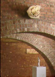
| UNDERNEATH THE ARCHES—New "Crypt" Spaces for Byzantine Art at the Met Museum. | |
Most of the corridor walls remain, but the newly opened crypt-like spaces add handsome areas for display of Byzantine treasures. Centuries ago, these powerful sculptures, religious objects, and precious artifacts would have been used and displayed in Byzantine buildings with vaults and arches suggested by the Met's once concealed infrastructure. The crypt-spaces also provide easy access under the staircase to both flanking corridors. [An architectural history dividend is the opportunity to study the unhewn, uneven undersides of the stair-step slabs!]

| |
| BYZANTINE SPRING—Woven image of Spirit of Spring in Met's new Byzantine galleries. | |
The core of the artworks and artifacts are Byzantine objects spanning the centuries, from 330-1453 AD. In 330, the capital of the Roman Empire was moved from Rome to Constantinople. In 1453, the Ottoman Turks conquered the great Eastern Capital and its territories. As Muslims, they were no lovers of idols and images of any kind. So it is amazing that so much art has survived.
Also on view are artworks from the Bronze and Iron Ages of Northern Europe, as well as art from the Latin West. Some of the latter works are early medieval, so the ensemble looks like a catch-all. Nonetheless, the curatorial effort to highlight Byzantine influences on western religious and secular art is rewarding, if viewers spend some time studying the works and reading the wall-texts.
| |
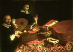
| ARTIST AT THE KEYBOARD—Evaristo Baschenis appears in the Aglilardi Triptych with the musical instruments he loved to paint. | |
But he was a true master in rendering old musical instruments on canvas. He devised a system of perspective for his musical portraits, so that lutes and horns looked almost three-dimensional when shown at angles. He was specially skilled in suggesting dust on the instruments. As though they were such precious collectibles that they were not often used to make music. Actually, Baschenis was a musician himself and collected both instruments and scores. He also used old manuscript music in his paintings.
But Baschenis's musical still-lifes are not exclusively silent studies of dusty lutes and viols. He also shows them being played, notably in the Agliardi Triptych, now on display at the Met. In one panel, he is himself playing a spinet in concert with Ottavio Agliardi. Another shows other members of this aristocratic Bergamo family also making music. These three impressive panels are part of the 18 Baschenis paintings in the current exhibition.
They are on loan from public and private collections in Bergamo and Northern Italy. For the press-preview and the opening, officials from Bergamo were on hand to talk about his achievements. As well as to promote the Museum Carrara and other cultural attractions of the city and province.
There is a handsome catalogue which bears the title of the exhibition. Its pictorial documentation—as well as informative essays—put Baschenis in cultural context and indicate influences on his work, such as Caravaggio. Not to overlook his own influence on later painters, even if his commissions were largely North Italian.
An expert on architectural perspective, Baschenis adapted this to the much smaller objects of the kitchen and the music-room. Not only did he have a collection of what are now called "authentic Instruments," some of them were already, in his own time, antique.
When he needed some "silent sitters" for a painting, Baschenis could use the actual instruments. But he also kept a sketch-file of perspective projections of favored lutes and viols. One of these appears in different placements in at least two of the paintings on view. With the dust on it intact!
Impressive as the Bergamo masterpieces are, 18 of them were obviously not enough for a special show. So the Met curators have raided their own stores for authentic instruments, antique scores, and historic objects such as those depicted in the Baschenis canvases. This does in fact give the show more dimension and depth, so it's well worth a visit.
| |
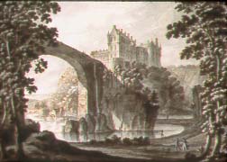
| HIGH BRIDGE TO CULLEN CASTLE—Robert Adam's soaring Scottish sketch on loan at the Frick Collection. | |
There are, of course, sketches by important Scottish artists on view, but they are mainly of the 18th and 19th centuries. Anyone who has admired the white marble statue of Allan Ramsay on Princes Street, opposite the National Gallery, but wondered who he may have been will find an answer at the Frick. He was one of Scotland's most distinguished painters, and the 1776 red chalk of his wife, Margaret Lindsay, illustrates his special talents.
Anyone who has studied the funerary monument of Robert Adam in Greyfriars Kirkyard in Edinburgh may well want to see his breathtaking sketch of Cullen Castle, with a great arched bridge looming from center to left. Adam, of course, was also famed as an architect, designer, and decorator.
Artists South of the Border are not neglected: Joseph Mallord William Turner's Afterglow on Mount Snowdon and William Blake's haunting scene of Job and the God in the Whirlwind are especially arresting.
Many of the Frick sketches—all master-quality, but bold or delicate by turns—are the work of continental talents: Da Vinci, Raphael, Rubens, Guercino, Goltzius, Jordaens, Baldung van Grien, Mengs, Fuseli, Von Schwind, Von Menzel, Boucher, Robert, and Ingres.
| |
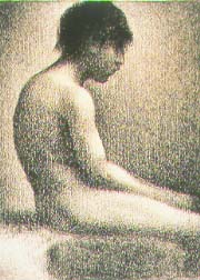
| STUDY BY SEURAT—European Master-Drawing on loan at Frick from Scots National Gallery. | |
| |
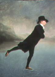
| PARSON ON SKATES—Raeburn's portrait of Scots minister on ice. | |
| |
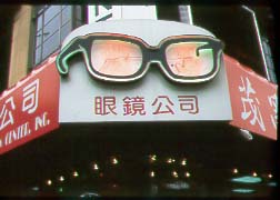
| HERE'S LOOKING AT YOU!—Martha Cooper's photo of colorful shop in Manhattan's Chinatown. | |
There are some hands-on adjuncts, to help school-kids and others think about the way small-scale commerce is carried on in New York City. Obviously, in many NYC neighborhoods, even small shops are more than just places to buy milk, the "Daily News," or get a haircut. They help create the sense of community. They define their area and its people.
| |
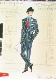
| NATTY NATHAN DETROIT—Alvin Colt's design for Broadway star of "Guys & Dolls," on view at Museum of City of New York. | |
Broadway columnist Damon Runyon—who celebrated the denizens of Broadway in the Prohibition Era and told their stories in magazine articles—is well represented. Including actual copies of the tales in the weeklies, as well as artifacts of their transformation for stage and screen: Shirley Temple, in "Little Miss Marker."
Ben Shahn's Public Works of Art Project paintings of New York during Prohibition and the Great Depression are also on view, along with other evocations of that lively time in Manhattan and the boroughs.
Rheba Crawford, a charismatic Times Square Salvation Army Lassie, is given her due as the model for the musical's heroine, Sarah Brown.
This attractively mounted exhibition will be on view until June 10, but it's only one element of a fascinating permanent third-floor celebration of New York Theatre over 150 years: "Broadway! The History of the American Theatre." "South Pacific" and the Astor Place Theatre Riot also star!
Now there is a stunning new center which will serve the purpose for all five Nordic Nations, including tiny Iceland. Considering its size and its GPO, it is noteworthy that Iceland contributed its one-fifth, along with the bigger Four, toward construction costs.
Although designed by the American firm of Polshek Partnership Architects, the close consultation of James Stewart Polshek with the sponsor, the American-Scandinavian Foundation, and leading Nordic experts has resulted in a most handsome and functional postmodernist structure. It wouldn't look out of place in Stockholm or Helsinki.
But it is a bit of a jolt to see it on Park Avenue South, sandwiched tightly between two taller structures of no especial character. You can't miss it, and it's a welcome change from the general serial boredom of Park Avenue facades below Grand Central Station.
The Center is designed not only for conferences, exhibitions, and research, but also for educational experiences. There are several attractive amenities and installations for school-kids.
The current exhibition is "Young* Nordic Design/*) generation x." That tricky title suggests some of the trendiness in the design of various household objects on view in the show. You may think you've already seen some of these artists' work at MoMA. Perhaps, but most of the creations—including art-objects as well as functional things—are so cutting-edge it may take MoMA a while to catch up with them.
No one of the American-Scandinavian Foundation was aware that I was made, decades ago, a Fellow of the ASF. No wonder: it was almost 40 years ago, and who now keeps lists?
I was awarded the honor to enable me to come to Sweden and experience its performing arts, museums, and distinctive folk-culture first-hand.
My sponsor was a founder of the American-Scandinavian Foundation, the late and entirely wonderful Adele Heilborn, an ardent builder of Educational and Cultural Bridges between America and Scandinavia. She was promoting exchanges of American and Scandinavian university students, which I was able to help by writing about the programs in "The Christian Science Monitor" and other publications.
The Fellowship carried no money, as Adele apologized, but it did open many doors for me. Including the opportunity to interview Ingmar Bergman when he was Director of the Royal Dramatic Theatre and to visit his film-sets at Svensk Film. I was even invited to stay summers in the huge Heilborn apartment in Stockholm, crammed with 18th century Swedish antiques. If Adele was at her country home, she would make a point of coming into the city to "give me lunch" and "catch up" on cultural matters on both sides of the Atlantic. At this time of year, I very much miss her annual Christmas card with a photo of Solka Gaard, her charming snowbound farmhouse.
So I wish Scandinavia House and its staff every success in the New Year and years beyond!
The Scandinavian Five have enriched America with their emigrants over the decades. And with their valuable inventions and stunning designs in more recent times. Not to overlook what we owe Edvard Grieg, August Strindberg, Henrik Ibsen, Edvard Münch, Carl Milles, and, of course, Ingmar Bergman.
Scandinavia House is located at 58 Park Avenue South [between 37th & 38th Streets], New York 10016. Phone: 212-779-3587. It's open Tuesday through Sunday, 11 am to 5 pm. Its Café Aquavit will soon open.
Otherwise, they might be both disappointed and baffled by the various mini-shows which have been collated for the higher floors. Last season, a number of similar one-room shows were presented under the rubric of "Making Choices."
This season, they represent "Open Ends." In both cases, however, these shows provided an excuse for MoMA curators to ransack basement and attic files and storage for holdings that otherwise would seldom be shown.
It's not that Cindy Sherman's concepts and actual photographs are trivial and self-indulgent. They are very professional photographs. But who needs to see a lot of them in one room?
Especially if you've already seen them at the Whitney?
But the new curatorial vogue for grouping artworks by subject-matter or themes—rather than by artist, chronologies, schools, or movements—now makes it possible to have similarly styled works by a particular artist in different rooms because the subjects are different, if not the perception or rendering of them.
"Open Ends" is also interested in illustrating the new mania for multi-media crossovers in the arts. If this had involved 19th century masters like opera-composer Richard Wagner with Edgar Degas and Jean Ingres as set and costume-designers, the artistic inter-stimulations would have been innovative, exciting, and influential.
But the contemporary talents involved in such projects are not modern masters. Nor are their visions arresting or compelling. Their collective imaginations and technical skills are simply not up to task they set themselves. If indeed, they really know what it is they are trying to achieve. A multi-media artwork is often simply another way of "spreading the blame," in case an alert critic takes exception.
By the time you read this, the first segment of "Open Ends" will be ready to return to storage—in preparation for MoMA's closure for construction of a new and improved Museum of Modern Art. This, as previously reported, included such cute elements as "Architecture Hot & Cold," "Innocence and Experience," "Matter," "One Thing After Another," Pop and After," and such large-scale three-dimensional works as "Broken Obelisk" and "Borrowing Your Enemy's Arrows."
The purposeful vagueness of some of these titles offers no clue to what is to be discovered in each gallery. Forget about what might be learned, or intuited, from viewing a variety of disparate artworks, united only in terms of cute thematics or obvious subjects. The wall-texts are supposed to do that for you, but often they seem to be serving a different agenda than that of any artist in the room.
At the end of January, more mini-shows will be packing up. They include "Counter-Monuments and Memory," "Minimalism and After." "The Path of Resistance," and "White Spectrum." These titles could have been hatched in an ad agency.
And what are we to understand from titles which cite a movement or style, following it with "and After"? That is really grab-bag inclusivity!
How about "Decline & Fall of the Roman Empire and After"? Or "Giotto and After"?
Fortunately, you have until March to view two of the most interesting elements of "Loose Ends." These are "Actual Size," spotlighting scale replicas large and small, and "Sets and Situations," featuring faked milieus and staged mini-dramas. The first is an obvious dumping-ground for Andy Warhol's Brillo Boxes. And what would the second show be without Cindy Sherman's photos of faked characters in fake situations. She is, of course, her own best—and cheapest—model.
Nation-wide social, political, cultural, and spiritual Dumbing-Down is now the rule. It was bad enough when TV was the principal perpetrator. But it is really sad to see major museums join the pack with cross-cultural multi-media crossovers. This exhibition and acquisition agenda may prove appealing to the mass-audience, which now must be courted and lured to the museums. It may even be seen as "relevant" to their lives and needs, with never a thought about real artistic genius, inspiration, originality, and technical skill.
At many trendy Manhattan galleries, anyone who desperately wants to be seen as an artist can find a niche if he or she can only devise an unusual gimmick that doesn't look borrowed from Jeff Koons, Julian Schnabel, Louise Bourgeois, or Sol LeWitt.
Then, it's only a matter of waiting—and some pushing and shoving from publicists—before the works are seen uptown at the Whitney Biennale or showcased at MoMA. Nirvana is achieved by being added to the Permanent Collection of MoMA or the Met.
Damien Hirst is surely a designate for Nirvana. But what about all those cows and sheep he slices up to put in his tanks of formaldehyde? Do they go to Heaven?
SCANDINAVIA HOUSE:
[Permanent Cultural Amenity]
Although there are already Swedish, Danish, Finnish, and Norwegian offices or bureaus where New Yorkers can get current information—and even travel advice—about the great Scandinavian democracies, none of these nations has been able to maintain its own Information & Cultural Center. Important events, such as national holidays, awards presentations, or launches of major exhibitions have usually been celebrated at the respective embassies or consulates.
The Nordic Center in AmericaAt MoMA, Loose Ends & "Open Ends"
[Closings January 30 & March 4, 2001]
For those art-lovers who have come from out-of-town, out-of-state, and from beyond US borders, it's a good thing that a sampling of the best known and most admired of MoMA's permanent collection of paintings and sculptures is on view on the ground floor. At the Whitney: "Sol LeWitt: A Retrospective"
[Closing February 25, 2001]
| |
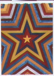
| FIVE-POINT STARBURST—Design from Whitney's Sol LeWitt Retrospective. | |
Especially as it took a large crew of lesser artists and crafts-people to do the actual painting of LeWitt's bold semi-geometric designs, from much smaller color-keyed sketches and detailed drawings.
LeWitt is perhaps the first "Conceptualist," and, for him, originating the Concept is the Act of Art. Not working out its details, nor actually rendering it in the often large scale originally conceived.
But he certainly does work out the details, as many plane and solid geometric sketches demonstrate. But, like fellow Conceptualist Jeff Koons, he doesn't have to execute his paintings, nor construct his intriguing sculptures either. Craftsmen can always be hired to do that.

| |
| WHITE GEOMETRY—Construction of Sol LeWitt Conceptualist design at Whitney. | |
Hilton Kramer, the severely conservative art-critic of "The Observer," found much of the new Whitney retrospective boring. As he already knew what to expect from LeWitt's much publicized theories and very public practice—often in big Public Spaces, but never executed by his own hand—Kramer was clearly prepared to be bored.
While I was entirely delighted by the bold contrasts of color on the walls and the dead-white geometrics of the constructions, I was not seeking any hidden meanings or social metaphors. Theme and Variations of an optical trick can be visually—and even imaginatively—rewarding enough.
Kramer's sour assessment of LeWitt's designs for the walls and floors of the Whitney show indicate that he wants artists to create works which are not entirely surfaces: artworks which stimulate the viewer's imagination and suggest much more than they reveal.
That was not to be expected with LeWitt. But then, Kramer knew that before he went to the Whitney.
Chances are, if you go to the Whitney, you not only will not be bored by LeWitt's designs. But you will also want to come back more than once to recharge your batteries with the brash colors and bold lines, as well as to ponder the geometric complexities of his sculptures.
Most obviously, they both are served by a system of canals. Indeed, Peter the Great thought of his magnificent Russian capital as the "Venice of the North."
Venice also has the Peggy Guggenheim Museum, of course. But another Guggenheim is not needed in Petersburg, as the great Hermitage Museum already takes days to explore.
The Guggenheim's resourceful Empire-Builder, Director Thomas Krens, has, however, found a way to bring the Hermitage into the Guggenheim Venetian orbit—without any Italian visa problems.
The Hermitage will join forces—and collections—with New York's Guggenheim to present exhibitions in another version of Venice. Not the one in Southern California, however, but across the Cal-Neva border in Las Vegas.
Cutting-edge Dutch architect Rem Koolhaas has already designed the "intimate jewel-box-like space" for Las Vegas' immense semi-replica of Venice Landmarks, the Venetian Resort-Hotel-Casino. The hotel is already, inside and out, so overloaded with decorative and architectural details that masterworks from Petersburg and Manhattan might well be overwhelmed.
Not to worry: Koolhaas is using Cor-Ten steel for the museum's walls. This is the impregnable metal Richard Serra uses for his sculptures. Possibly it could be wired to electrocute art-thieves and tourists who feel they have to touch great paintings to get in touch with their spiritual qualities?
And what do the Hermitage and the Guggenheim have in common, excluding the tenuous connection of canals and Peggy Guggenheim? Thanks to Karl Marx, V. I. Lenin, and Josef Stalin, the Hermitage has almost nothing of importance of 20th century art. Socialist Realism artworks don't count.
Fortunately for this odd partnership, the Guggenheim has all those Kandinskys and other modern masterworks. It's not the greatest or most varied collection of modern art in American museums, but at least it's more than the Hermitage's holdings.
The hope of both museums—and their directors—is that the Vegas Venetian venue will bring great artworks to the masses. Maybe. If they are not rushing off to see Siegfried & Roy and the White Tigers. Or the live Pirate Ship battle at Treasure Island—which is completely free.
Of course there are some modern masterworks on view over at the Bellagio, from Steve Ross's collection. But none from the Hermitage!
There's already a Guggenheim in Berlin on Unter den Linden. Frank Ghery's Guggenheim Bilbao is built, but Basque Terrorists make it a chancy visit. The new Ghery Lower East Side Guggenheim now seems a certainty as well.
Does the Guggenheim want to rule the world? When I was recently in Shanghai, I heard a rumor about Guggenheim probes into the Land of the Han. Surely Las Vegas is foreign enough?
Only Mozart's Salzburg has rejected repeated attempts by Krens to carve more caverns in the mighty Mönschberg mountain for a new Austrian Guggenheim. The great stone mountain—looming over the historic city and crowned by Salzburg's medieval Festung—is already riddled with traffic tunnels, parking facilities, and backstage areas for the Salzburg Festival Theatres.
Who wants to look at Rembrandts and Kandinskys in a cave anyway?
[Loney]
Copyright © Glenn Loney 2000. No re-publication or broadcast use without proper credit of authorship. Suggested credit line: "Glenn Loney, Curator's Choice." Reproduction rights please contact: jslaff@nymuseums.com.
Guggenheim Plot to Conquer the World!
What does Venice, the Pearl of the Adriatic, have in common with Leningrad? Or, more recently and accurately, St. Petersburg?
Next Phase: Invasion of Las Vegas